The Whole Story in One Place
━━━━━━━━━━━━━━━━━━━━
REMODEL NEARLY 20 YEARS OVERDUE
MEGAPOST 4 YEARS OVERDUE
BUT HERE IT IS!
━━━━━━━━━━━━━━━━━━━━
Kitchen Help Wanted
GB Shaw Aug 25, 2011
A False Start
For 14 long years we've suffered with one of the most outdated kitchens left in America. No, really - I mean that! It's not just hyperbole! Anyway, like I've mentioned in a previous post or two, it's time to start addressing this issue. Yaaay! Wait, wait, wait - don't get too excited yet. I'm still in the "thinking-about-how-to-go-about-the-whole-thing" stage. I read a lot of great blogs, and watch all kinds of shows on HGTV, and they all make it look so easy. Heck, on HGTV these people have new kitchens in an hour - and that includes commercials!
Excuses
I'm really not procrastinating here. I need to plan, mull, plan, fret, plan, understand, fret, plan before I can really dig in. And that's where YOU come in! With all the great bloggers out there - could, or better yet, would any of you care to share a simple step-by-step? I don't mean the details, just the logical steps to get from beginning to end. Here's what I know so far...
- Set up a temporary kitchen in the dining room.
- Gut the kitchen.
Aaaaand, that's about it! What next? Update the wiring THEN update and move the plumbing? At what stage does the insulation go in? When does the floor go in? Last? No, that wouldn't make sense...hmmm.
So you see what I'm looking for? Please don't feel the need to spend a lot of time with details, just the logical progression. Thanks in advance for any thoughts one might have! Oh, and just for fun - here's a preview pic of the kitchen as she stands now!
The kitchen is a place of adventure and entirely fun, not drudgery. I can’t think of anything better to do with family and friends than to be together to create something. - Ted Allen
So you see what I'm looking for? Please don't feel the need to spend a lot of time with details, just the logical progression. Thanks in advance for any thoughts one might have! Oh, and just for fun - here's a preview pic of the kitchen as she stands now!
Water!
GB Shaw August 16, 2016
Hate to Say I Told You So!
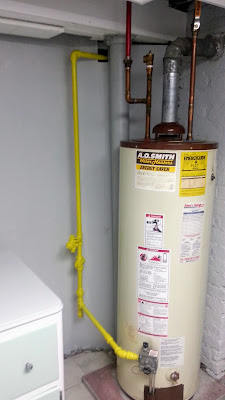
For years I've been saying 173 was living on borrowed time with the hot water heater. I mean, if you looked at it you'd think it was fairly new - but no:This fine piece of equipment was installed in 1994..
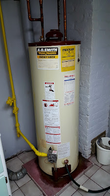
Yesterday she finally gave out. After my shower I went down to the laundry room for something and I saw the water on the floor and realized this was the day.
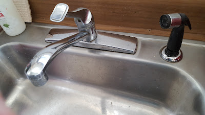
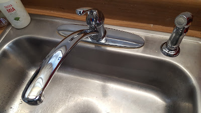
Same manufacturer but what's the odds this one will last as long? And you know how one thing leads to another? Well, I thought I might as well change the kitchen faucet (this I did myself), Here's the most boring picture ever taken - the old faucet:
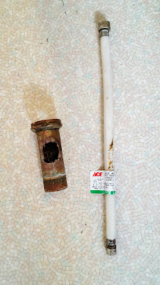
Then, you see that length of pipe? The one with the big hole in it? Well, that's the drain pipe. And that hole is where the dishwasher was once attached. In working under the sink, I must have leaned on that line and broke it clean off. To the store!
Anyway, that job is done. Here's an equally boring pic:
Okay - 'til next time!
The Kitchen - Part 1: Wainscoting
GB ShawMay 14, 2017
It's About Time!
It's been awhile since the last post, but with school and work, projects generally have to take back seat. However, one project did get started in the midst of my last class - the kitchen. I still recall the day we had the first viewing of 173 way back in 1997, and the first thing noticed was that the kitchen needed to be redone. Well, here we are 20 years later, and it's finally getting a refresh. I'm still looking forward to one day having a complete remodel, but at least for now it's looking better. The kitchen was so bad, I used to take pictures in black and white:Here's an old grainy pic looking toward the front hallway. Dear lord, when you are living in it, you don't realize how bad it looks...soooo much stuff!
Same end, looking at the other side:
A good home must be made, not bought. In the end, it's not track lighting or a sun room that brings light into a kitchen. - Joyce Maynard
Then looking toward the back yard:
As I go through this post, I'll point out a few key items...like:
This is in the breakfast nook. The paint on the walls was peeling badly...I wanted to tear the walls out, but this was intended to be a quick refresh, so I just went with wainscoting. Just like the basement stairwell, I milled my own chair rail, and the rest easy peasy!
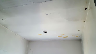
Good start. But then there was the ceiling. It looked like they butted sheetrock up against plaster-and-lathe, and over the years the joint loosened and of course there was the ever-present loose paint:
Then there was this hole, that I created when there was a leak from the bathroom. I'm not going to tell you when that occurred, but here's the post about that.
So, what to do? I know! Go over it! Stay tuned!
The Kitchen - Part 2: Ceiling
GB Shaw May 14, 2017
New Kitchen Ceiling - Harder Than You'd Think
When last we met, the kitchen ceiling was old and cracked, and maybe even close to falling in. I think it's likely the original ceiling from 1927 and it looked like this:
Obviously, it was time to do something about this! So the best idea I had (absent ripping it all out - which I wasn't ready to do) was to go over that mess. Why I felt the staging area for the beadboard needed to be in the entryway I'll never know, but there it is...
The thing is, the beadboard was so heavy, it had to be cut in half to make installation even possible. I'll tell you - that was a tough day!


All of which meant the seams would need to be covered. At first I was really disappointed with the idea, but as you'll see when this is all done - it turned out to be okay because it added a nice architectural interest to the ceiling.
There's probably an easier or better, more professional way to make sure the boards lined up - but I couldn't think of one! Here's one last look at the old ceiling - buh bye!
So, that's the ceiling until the reveal. It came out quite nice, but to be honest pulling it down and putting up a new ceiling would have been a thousand times easier. Because of the plaster-and-lathe and the weight of the panels, I had to use toggle bolts (look closely at the pictures) to make the panels flush with the ceiling. These things worked great:
Next up: The walls!
Obviously, it was time to do something about this! So the best idea I had (absent ripping it all out - which I wasn't ready to do) was to go over that mess. Why I felt the staging area for the beadboard needed to be in the entryway I'll never know, but there it is...
The thing is, the beadboard was so heavy, it had to be cut in half to make installation even possible. I'll tell you - that was a tough day!

Our fondest memories are made gathered around the table with family and friends. - Author Unknown

All of which meant the seams would need to be covered. At first I was really disappointed with the idea, but as you'll see when this is all done - it turned out to be okay because it added a nice architectural interest to the ceiling.
So, that's the ceiling until the reveal. It came out quite nice, but to be honest pulling it down and putting up a new ceiling would have been a thousand times easier. Because of the plaster-and-lathe and the weight of the panels, I had to use toggle bolts (look closely at the pictures) to make the panels flush with the ceiling. These things worked great:
Next up: The walls!
The Kitchen - Part 3: Walls
GB Shaw May 14, 2017
What a Mess
The walls were solid, but paint was peeling everywhere, and there were some rough spots throughout, Look closely at this picture and you'll see all the spackle used to do some repairs. You can see it because the spackle goes on pink, then pales as it dries.
And, this next picture shows where there was a large dip in the wall that leads to the dining room. It was significant enough that it made the ceiling look horrible, and I had to put so much spackle on that I layered in some vinyl sheetrock tape, to help prevent cracking.
I liked it because it went on pink, and when it was dry it turned white, taking the guessing game out of it. Besides that, as to quality - well, it worked just like any spackling I suppose.
Then there was the area behind the stove - what a mess. All these years there was this big piece of metal on the wall behind the stove, and a large piece of melamine on the wall next to it:
I know that's looking pretty hideous at this point, but it gets better. I had run out of the brick-relief paneling, so I used some leftovers from the ceiling for the lower half behind the stove - it'll never be seen! That's the run-down of the walls (no pun intended!).
And, this next picture shows where there was a large dip in the wall that leads to the dining room. It was significant enough that it made the ceiling look horrible, and I had to put so much spackle on that I layered in some vinyl sheetrock tape, to help prevent cracking.
You know, you really can't beat a household commodity - the ketchup bottle on the kitchen table. - Adlai Stevenson I
I used this stuff:
I liked it because it went on pink, and when it was dry it turned white, taking the guessing game out of it. Besides that, as to quality - well, it worked just like any spackling I suppose.
In department stores, so much kitchen equipment is bought indiscriminately by people who just come in for men's underwear. - Julia Child
Then there was the area behind the stove - what a mess. All these years there was this big piece of metal on the wall behind the stove, and a large piece of melamine on the wall next to it:
And here's the sheet of metal behind it:
Luckily it all came off pretty easily, but how ugly is that glue?
Only one thing to do - cover it:
I know that's looking pretty hideous at this point, but it gets better. I had run out of the brick-relief paneling, so I used some leftovers from the ceiling for the lower half behind the stove - it'll never be seen! That's the run-down of the walls (no pun intended!).
The Kitchen - Part 4: Cabinets
GB Shaw May 23, 2017
Refurb the Old and Install Some New
The cabinets were a bitter-sweet project. The sweet part was adding a couple new base cabinets, new countertops, new color and new handles. The bitter part was kinda two-fold. First - I wanted to tear them all out and start afresh, but at the same time this was a refresh more than a complete remodel. Besides that - I hate to get rid of these huge, solid, built-in-place cabinets:
Alas, they had to stay, which was okay in the end because of my constant struggle to want to keep things here at 173 as close to "original" as I can (within reason). One of the big problems in the kitchen is lack of counter space. On the side with the sink, this was compounded by a third of the countertop essentially disabled by the design of the cabinets, and the low placement:
You can really see that in the area of that pineapple. See how the sides of the cabinet sloped down? Not only that, there was also a little half-shelf at the bottom of it - leaving about 3" below it to the counter, and maybe 10" in front (Sorry for the terrible quality - early cell phone camera!):
In a kitchen with precious little counter space - this was a real hindrance. Maybe this is a better picture:
After much deliberation, there was only one thing to do. Pull out this saw:
And have at it:
Believe it or not, it made a huge difference! Then there's the counter tops. Look closely at the picture below. Ah heck - you don't even have to look closely!
Notice the two different tops? One is the 1950s teal blue (which I like by the way), and the other is a wood grain laminate. That's because of this thing!:
Yes, ladies and gentlemen! That's the sink/dishwasher combo. It may have been a good idea in the '50s, but it was hideous! And, it was so old, the dishwasher hasn't been used for anything but a storage cabinet for the past 20 years! But let me tell you something - that stinkin' thing was built to last! Couple that with Mr. Mosher installing it to withstand a nuclear blast and you have almost 8 hours of cussin' and swearin' trying to get that thing out!
I mean, I had to literally tear it out. That dishwasher was incredibly heavy, but I was so frustrated by the time I got it out that I picked it up, hauled it outside and dumped it in the yard until Sunday night when one of those guys that pick up scrap metal on trash night helped me haul it to his truck.
All of which left the kitchen with a view of every color and surface used in the kitchen in the 90 year history of 173!
Oh, and here's the dishwasher wiring just a-comin' through the wall!
Then came time to figure out how to reconfigure a couple new base cabinets and marry them up with a couple old/original ones. I hated to cut into the cabinet floor, but in the end, you do what you gotta do.
You know how, when you pay money for something, even at a very affordable price, and you just don't want to screw something up to the point you'd have to go buy another one? And you know all the pressure you put on yourself? Well, I had to cut part of the counter off because I just couldn't squeeze another inch of wallspace...so I got a bit stressed. Setting up for the cut involved more than just a few YouTube videos (again), and at least an hour of measuring, aligning, and re-measuring and re-aligning. I was going to use my little 4" circular saw, but I got nervous about controlling it, so I went with the trusty ol' hand saw!
Meanwhile, with uneven walls and unlevel floors, installation of the cabinets was a ball! And trying to fit the sink base just so was a bit tricky too, but it did end up coming together.
Then, of course, came another cut in the counter. I'd never cut a hole for a sink before, so I watched a another bunch of YouTube videos - really, a ridiculous number of YouTube videos. After all that, I nearly screwed it up anyway, but it worked out - barely.
Eventually, the cabinets and sink were all installed:
Luckily, the base cabinet on the other side of the kitchen didn't require any cutting (except for one small thing I'll get to later - probably!).
Here's a little bonus shot so you can see both counters at once. It also shows the extent of mess that was going on in the kitchen!
One more bonus shot - told ya - MESS!
And that's the story of the cabinets. We're getting there, I suppose the next post will be about the painting of it all!
Made at 173: The (New) Medicine Cabinet
GB Shaw June 02, 2017
In our last post I talked about an old Made at 173 project - the old medicine cabinet.
As you can see, the cabinet was overflowing with those remedies to ameliorate the pains and dyspeptic disorders of the aging denizens of 173, Clearly it was time for a larger cabinet, and what better time than after a relatively major project that left scraps lying about the ol' workshop. If you've read this blog for any amount of time, you know I like finding uses for project scraps, most of which can be seen on the Made at 173 page at the top of the blog.
Health is the state about which medicine has nothing to say. - W. H. Auden
And so it began, The plan was simple - make a bigger medicine cabinet, and use only materials leftover from the kitchen project, or stuff on hand at 173.
The divider and shelves were an interesting mix...sawn-to-size, repurposed shelved from the kitchen nook, a piece of scrap wood, and a piece of scrap PVC board from some long-forgotten project. The door were also made from some piece acquired long ago:
The hinges were leftover from the kitchen, but that isn't saying much. When I ordered hinges off Amazon, I didn't read carefully, and didn't know hinges came in pairs (doh!). So I ended up with twice the number of hinges that were needed...know anyone that needs hinges? The handles (seen below) were the original cabinet handles, which is a nice way to integrate the original, which is something I always like to do if I can. I also went retro, old-school, old fashion (or whatever else you wanna call it) and painted the cabinet white (leftover paint from the kitchen).
But - it was just a little too plain. So, like I did with the buffet-side cart-typing table-thingy in the dining room, I made a stencil to add just a modicum of design to the cabinet:
And so, without further ado, here is the new medicine cabinet in its natural habitat:
There you go, a fun and useful little project - Made at 173!
PS: That picture gives a hint at the kitchen reveal which is coming soon!
The Kitchen - Part 5: Paint
GB Shaw June 18, 2017
Paint Really Makes the Difference!
I soooo want to post the final pictures of the kitchen, but there's one more little job in there that needs to be done and I simply haven't gotten to it...soon...I promise. In the meantime, I thought I'd do one of those posts that's primarily for me. From time-to-time I post about a product of some kind or other, just so I have a record of it in case 173 needs it in the future. In this case - it's paint. But before I get there, let me show you something...
All of those seams where trim met trim, trim met ceiling, trim met wall, nail holes, wood flaws, etc., needed caulking, Yeah...that was a little tedious! On the upside, I've become pretty efficient at caulking, and find it somehow...therapeutic! Please don't ask me to explain - I can't!
Okay - on to the paint! Selecting the colors for the kitchen was surprisingly easy, there was an original plan, and then may two or three revisions until the scheme was decided upon. Of course I looked a lots of pictures on the net, and found some very inspiring shots! For instance, I loved this one, it's very retro (which I love) and it's the colors of the Green Bay Packers:
But, in the end something like that really needs to wait 'til there's a full scale remodel...a simple refresh would never end up like that! Then there was this one:
Obviously it wasn't the whole thing that attracted me, but I do love the table and benches in the nook, and I still may do this at some point! In the end, this picture turned out to be the final inspiration:
From the gray cabinets, to the handle styles...this one was a winner for me! I know gray cabinets are a fad right now, but I also think gray is pretty timeless, and - you can put just about any color with it. And those handles were sharp! I loved the simplicity, and while a bit modern, I thought they could work well in the retro kitchen which is 173!
Gray and white would have been simple, but we needed some color. That's where those color-coordination booklets from Lowes and Home Depot really helped out. This kitchen color series was really nice.
Of course the ceiling was going to be white, but we wanted a slightly off white. It's hard to see in the picture below, but Hailstorm Gray really looked nice. To cut down on cutting-in worries, the ceiling and the walls would be the same color, just using different finishes.
Woodlawn Colonial Gray ended up being the choice for the cabinets. The nice thing about this particular shade is that it's neither too dark nor too light. As in the proverbial children's story, this one was just right!
Then came the color. I love yellow, and 173 has three outside doors, all of which are yellow, But It just didn't seem to be the color for the kitchen. This was the color that caused the most anxiety, although even that was limited as the right color came along relatively quick. This color we selected from the Olympic line:
Apt name for a kitchen color I suppose. It doesn't look like the color is showing very well on the screen so I'll add a little sneak-peak picture.
Wow! It really does matter what screen you're looking at! Anyway, as you can see below - "Cool Slate" was the early choice for a cabinet color, but after viewing it in different parts of the kitchen, and at different times of day and night, it was simply too light, and even had a tinge of brown in it.
I think the color choices came out nice, and as soon as I finish up that one last little task, the glamour pictures will be up!
All of those seams where trim met trim, trim met ceiling, trim met wall, nail holes, wood flaws, etc., needed caulking, Yeah...that was a little tedious! On the upside, I've become pretty efficient at caulking, and find it somehow...therapeutic! Please don't ask me to explain - I can't!
I have an idea that the only thing which makes it possible to regard this world we live in without disgust is the beauty which now and then men create out of the chaos. The pictures they paint, the music they compose, the books they write, and the lives they lead. Of all these the richest in beauty is the beautiful life. That is the perfect work of art. - W. Somerset Maugham, The Painted Veil
Okay - on to the paint! Selecting the colors for the kitchen was surprisingly easy, there was an original plan, and then may two or three revisions until the scheme was decided upon. Of course I looked a lots of pictures on the net, and found some very inspiring shots! For instance, I loved this one, it's very retro (which I love) and it's the colors of the Green Bay Packers:
But, in the end something like that really needs to wait 'til there's a full scale remodel...a simple refresh would never end up like that! Then there was this one:
Obviously it wasn't the whole thing that attracted me, but I do love the table and benches in the nook, and I still may do this at some point! In the end, this picture turned out to be the final inspiration:
From the gray cabinets, to the handle styles...this one was a winner for me! I know gray cabinets are a fad right now, but I also think gray is pretty timeless, and - you can put just about any color with it. And those handles were sharp! I loved the simplicity, and while a bit modern, I thought they could work well in the retro kitchen which is 173!
Gray and white would have been simple, but we needed some color. That's where those color-coordination booklets from Lowes and Home Depot really helped out. This kitchen color series was really nice.
Of course the ceiling was going to be white, but we wanted a slightly off white. It's hard to see in the picture below, but Hailstorm Gray really looked nice. To cut down on cutting-in worries, the ceiling and the walls would be the same color, just using different finishes.
Woodlawn Colonial Gray ended up being the choice for the cabinets. The nice thing about this particular shade is that it's neither too dark nor too light. As in the proverbial children's story, this one was just right!
Here are the swatches we were looking at:
Then came the color. I love yellow, and 173 has three outside doors, all of which are yellow, But It just didn't seem to be the color for the kitchen. This was the color that caused the most anxiety, although even that was limited as the right color came along relatively quick. This color we selected from the Olympic line:
And here it is!
Apt name for a kitchen color I suppose. It doesn't look like the color is showing very well on the screen so I'll add a little sneak-peak picture.
Wow! It really does matter what screen you're looking at! Anyway, as you can see below - "Cool Slate" was the early choice for a cabinet color, but after viewing it in different parts of the kitchen, and at different times of day and night, it was simply too light, and even had a tinge of brown in it.
I think the color choices came out nice, and as soon as I finish up that one last little task, the glamour pictures will be up!
Back to the Kitchen
GB Shaw June 10, 2018
Time for the Floor
No, this isn't a Legacy Project, it's a whole new project that rounds out a recent project. Back in June of '17, the kitchen makeover was all but done. As a matter of fact, in the last kitchen post I even mentioned that there was one more thing to do, and I was going to get to it soon. Well, a year later - here we are! A year ago, the kitchen here at 173 looked like this:
The ceiling, wainscoting, lighting, walls, some cabinets, countertops and paint were all new, and was a far cry from this grainy old photo from sometime in the late '90s:
But, in case you hadn't noticed, there aren't any shots that clearly show the floor. For many decades I'm sure, and at least since before 1997, the kitchen floor was sheet linoleum, and was in pretty decent shape - especially for its age. But in recent years, the floor (like me) has been showing its age. The seems had come loose,
If you're read this blog much at all, you know I like old-school stuff (to a reasonable point), and I always liked this floor, but alas - the time has come to put in a new floor. As always, I spent several weeks researching products, and studying how to install a new floor. During my research, I learned that laminate wood flooring can work in the kitchen, but isn't the ideal choice. And speaking of choices - have you looked to see the endless options? It gets dizzying! Anyway, after much research and just plain ol' mulling over, it came down to Lowes' Smartcore Luxury Vinyl Planks (LVP), and Home Depot's LVP. Both were highly rated, and I was having a hard time deciding, so it came down to who had the right color, and who had that color available locally. And without further ado, the winner is - Home Depot's Lifeproof Luxury Vinyl Planks. It got great reviews all over the internet, and they had the right color; and that color is...
Sorry for the scribbled notes, but that's my way of keeping track of things. I'm not normally an oak person, but the color seemed medium and neutral enough not to clash with the rest of the woodwork here at 173. Maybe the most important thing in that picture is circled in red. I had to search all over the area for Essential Oak 'til I found some less than five minutes from work. The day after I found it online I ran over and picked some up on my lunch break, worried that someone would come in and snatch all 49 boxes before I could get there!
The first thing I had to do when I got home that night was pull up all the old linoleum. It took me an hour to pull up about a three foot piece, and I thought - no way am I going to spend a week pulling this up. The linoleum was very solidly attached, and the LifeProof product said the LVP could be applied directly over it. So I used some Henry's patch stuff and filled in what I had just torn up...
And I gotta tell ya - the oscillating saw was the perfect tool for so many things in this project! Oh, and as it turns out, the manufacturer said that kitchen cabinets should be installed before putting the flooring in, which worked out well considering the cabinets have been in for about a year! But there's one little thing about the cabinets...the end cabinet is original to 173 and was integrated into the new cabinets. This is great except the base of the cabinet has a curved corner. It looks nice, but I was a little concerned about how to cut the LVP to fit properly around the curve. Then I realized I have the perfect tool for just such a circumstance!
And the best shot so far for a couple reasons, the color is closer to real life, and - there's Linus!
There's a couple details to wrap up, and one little surprise, both of which I'll show in the next post!
First I did the transitions between rooms. This picture shows the transition to the front hallway which, as you can see, needs to be refinished - that'll come eventually. I'd show the transition to the dining room, but there's a little surprise there so I'm going to wait until the final reveal.
Now it's time to work on the molding around the baseboards. First let me say - I have this awesome sliding compound miter saw that I picked up when I was working on the dining room built-in.
But for some reason, for this project I'm using a cheap old-school miter saw box I picked up at the Home Depot sometime in the late '90s.
I think I'm using this because the kitchen floor contacts five different doorways, and using this old miter box gives me a little more control when cutting very small pieces. But, some of the quarter round is long and straight - pretty simple.
First, a little kitchen humor...
But, the end of the cabinets on the sink side of the kitchen have a curved base. I fretted over what to do and how to trim around a large curve until, just out of desperation I Googled "flexible trim" and came across a product I didn't know even existed! ResinArt's 3/4" quarter round:
That's right! So flexible it can be coiled up! I had no idea what I was getting when I ordered it on Amazon, but when it arrived I was more than impressed. It's definitely flexible, but it's not at all flimsy, cuts and sits jest like wood, and even has a very natural-looking wood grain. Most of all - it solved my problem:
I haven't filled the nail holes yet, but once that's done it'll all be painted. The manufacturer says any paint will work with this molding, so we'll see. I wish I knew about this stuff years ago! Okay, see you all soon!
And this...
And...
The ceiling, wainscoting, lighting, walls, some cabinets, countertops and paint were all new, and was a far cry from this grainy old photo from sometime in the late '90s:
But, in case you hadn't noticed, there aren't any shots that clearly show the floor. For many decades I'm sure, and at least since before 1997, the kitchen floor was sheet linoleum, and was in pretty decent shape - especially for its age. But in recent years, the floor (like me) has been showing its age. The seems had come loose,
and there was a spot I had glued down a couple times...
If you're read this blog much at all, you know I like old-school stuff (to a reasonable point), and I always liked this floor, but alas - the time has come to put in a new floor. As always, I spent several weeks researching products, and studying how to install a new floor. During my research, I learned that laminate wood flooring can work in the kitchen, but isn't the ideal choice. And speaking of choices - have you looked to see the endless options? It gets dizzying! Anyway, after much research and just plain ol' mulling over, it came down to Lowes' Smartcore Luxury Vinyl Planks (LVP), and Home Depot's LVP. Both were highly rated, and I was having a hard time deciding, so it came down to who had the right color, and who had that color available locally. And without further ado, the winner is - Home Depot's Lifeproof Luxury Vinyl Planks. It got great reviews all over the internet, and they had the right color; and that color is...
Sorry for the scribbled notes, but that's my way of keeping track of things. I'm not normally an oak person, but the color seemed medium and neutral enough not to clash with the rest of the woodwork here at 173. Maybe the most important thing in that picture is circled in red. I had to search all over the area for Essential Oak 'til I found some less than five minutes from work. The day after I found it online I ran over and picked some up on my lunch break, worried that someone would come in and snatch all 49 boxes before I could get there!
The art of bread making can become a consuming hobby, and no matter how often and how many kinds of bread one has made, there always seems to be something new to learn. - Julia Child
The first thing I had to do when I got home that night was pull up all the old linoleum. It took me an hour to pull up about a three foot piece, and I thought - no way am I going to spend a week pulling this up. The linoleum was very solidly attached, and the LifeProof product said the LVP could be applied directly over it. So I used some Henry's patch stuff and filled in what I had just torn up...
Then I had to undercut the door jams:
So with that figured out, the LVP starting going down:
It's interesting how the color changes with the light:
Looking toward the breakfast nook:
And the best shot so far for a couple reasons, the color is closer to real life, and - there's Linus!
There's a couple details to wrap up, and one little surprise, both of which I'll show in the next post!
Kitchen Floor - Working on the Details
GB Shaw June 22, 2018
Meeting Five Doorways
When last we met the new kitchen floor was in, but the detail work still had to be done.Now it's time to work on the molding around the baseboards. First let me say - I have this awesome sliding compound miter saw that I picked up when I was working on the dining room built-in.
But for some reason, for this project I'm using a cheap old-school miter saw box I picked up at the Home Depot sometime in the late '90s.
I think I'm using this because the kitchen floor contacts five different doorways, and using this old miter box gives me a little more control when cutting very small pieces. But, some of the quarter round is long and straight - pretty simple.
First, a little kitchen humor...
Some of our most exquisite murders have been domestic, performed with tenderness in simple, homey places like the kitchen table. - Alfred Hitchcock
But, the end of the cabinets on the sink side of the kitchen have a curved base. I fretted over what to do and how to trim around a large curve until, just out of desperation I Googled "flexible trim" and came across a product I didn't know even existed! ResinArt's 3/4" quarter round:
I haven't filled the nail holes yet, but once that's done it'll all be painted. The manufacturer says any paint will work with this molding, so we'll see. I wish I knew about this stuff years ago! Okay, see you all soon!
Last Post on the Kitchen Trim (probably)
GB Shaw June 28, 2018
Cutting the Bottom of the Door - Scary
Ninety-nine percent sure this will be my last post on the kitchen floor trim. I'm still working on the details, so I thought I'd throw in a little progress post here. One of the things I put off for a couple days was the door that goes to the basement. The LifeProof vinyl planks I put in are almost 7 mm thick so the bottom of the door had to be trimmed. In this picture you can see that the bottom hung just below the level of the planks. At this point I still had one small piece of flooring to install, and it was time to do it.
AAAh! I just noticed - ignore the dog hairs on the floor - Linus is everywhere! Moving on - I put painter's tape on the door for two reasons: to protect the door from even more scratches when I ran the saw across it, and to give some contrast to the pencil line.
And let me take a minute to point out that tool...it's called a Simple Scribe, and it's aptly named! I've used it a couple times and it's well worth the $10 or so that I paid for it. I've never been good at using a compass, and this little tool just took all the guesswork out of scribing an accurate line for trimming! Anyway, here's a wider shot of the door:
The funny thing was, I really over-thought and over-stress about trimming this door. I mean, it's a solid wood door and I was only taking a quarter inch off the bottom, but I put myself through two YouTube videos to make sure I was doing it right. Crazy - sometimes I lose a bit of confidence.
In half an hour's time the door was trimmed, the bottom re-stained and the door re-hung.
I was even able to re-use the stair-edge protector that's probably been there at lease 30 years!
Finally, a little picture of me ripping a small piece of trim.
I only include that here to remind me of the funky and sometimes wonky trim needed for this project. Hopefully when all is said and done, the trim will just melt into the scenery!
AAAh! I just noticed - ignore the dog hairs on the floor - Linus is everywhere! Moving on - I put painter's tape on the door for two reasons: to protect the door from even more scratches when I ran the saw across it, and to give some contrast to the pencil line.
And let me take a minute to point out that tool...it's called a Simple Scribe, and it's aptly named! I've used it a couple times and it's well worth the $10 or so that I paid for it. I've never been good at using a compass, and this little tool just took all the guesswork out of scribing an accurate line for trimming! Anyway, here's a wider shot of the door:
The funny thing was, I really over-thought and over-stress about trimming this door. I mean, it's a solid wood door and I was only taking a quarter inch off the bottom, but I put myself through two YouTube videos to make sure I was doing it right. Crazy - sometimes I lose a bit of confidence.
A great part of courage is the courage of having done the thing before. - Ralph Waldo Emerson
In half an hour's time the door was trimmed, the bottom re-stained and the door re-hung.
I was even able to re-use the stair-edge protector that's probably been there at lease 30 years!
Finally, a little picture of me ripping a small piece of trim.
I only include that here to remind me of the funky and sometimes wonky trim needed for this project. Hopefully when all is said and done, the trim will just melt into the scenery!
Made at 173: Simple Shelf for the Kitchen
GB Shaw March 28, 2019
A Very Early Project at 173
Sometimes I post old projects just for posterity - this is one of those posts so please bear with me.When we first bought 173 back in '97, one of the first things we did was paint the kitchen, of course it really needed much more than that but back then there just wasn't the money. But I had gotten a Craftsman router and I was dying to use it.
The kitchen is the heart of every home, for the most part. It evokes memories of your family history. - Debi Mazar
And because the kitchen table is hunter green...
After sanding the daylights out of those old brackets, I used the old Krylon...
to paint them hunter green to match the table...
Anyway, after a couple practice passes on a piece of scrap wood I gave it a go! This was quite a few year ago so there's no action pictures, but here's how it turned out:
Sure, it wasn't the finest piece of wood, and as you can see about midway in the lines got a little wavy but geeze, I sure was proud! I don't remember the color of the stain, but it turned out a decent color and didn't clash with the tabletop. This is how it looked back about '98 or '99:
And here it is after the 2018 kitchen re-do:
And a bonus shot...
I know, lots of writing for such a simple little project, but isn't that the fun of having a blog?
Dirty Little Secrets at 173
GB Shaw June 16, 2019
Doesn't this look like a beautiful ocean storm scene? The clouds, the white-capped waves - stunning!
Ah, but don't be deceived. This is actually a cropped photo of a dirty little secret here at 173...
That's right - the kitchen windows here at 173 have been a dirty little secret for years! The louvred windows were probably pretty cool way back when, but the fact is, this particular set hasn't been opened since probably around 1998. Yup, 1998. The problem was the lever that opened them had broken long before we bought the house, and in the beginning we could push them open and pull them closed. But it came to the point that they couldn't be closed tight enough to keep the air out in the winter, so they were pulled as tight as possible and weather stripping, lots of weather stripping was used to try to keep as much arctic air out as possible. However, that was pretty much in vain, to the point that when dinner was on the table in the winter, whatever was closest to the window got cold mighty fast! Hand to God - true! And for years I would take pictures strategically in an attempt to hide this embarrassment!
That was probably '98 or '99, always long shots, windows covered as much as possible, etc. Oh, and there's a set over the kitchen sink too!
The problem was I could figure out how to remove those old windows without destroying stuff, Every so often I would study it out and think - in a couple more years I will have gained more knowledge and skill and then I'll do those windows. Ha! I had a serious case of avoidance!
But then last fall I ran into a neighbor who said he could help. Of course there were hangups, He had to have surgery, so we missed the fall window, and I wasn't going to take windows out in the winter! Then there was a delay at the factory in having the windows fabricated. I was worried it wasn't going to happen. Then it did...
The old windows came out pretty quick, and the new ones went in even quicker!!
With the back window I pulled out the trim and the sill...
So I made a new sill, here's the specs for future reference (who knows when I might need to do another one!)...
Here's where we are now. I have another project in store, so hopefully in a few week this will look altogether different! And no, the window isn't crooked, the photographer is!
The side window didn't need as much though...
And installed - just a little more trim work to do...
Here's a couple interior shots...over the sink:
And the breakfast nook:
And this is the last shot, the breakfast nook again.
I don't have another of the window over the sink, but I'm sure it'll show up - no more dirty little secrets to hide!!
Thanks for making it to the end of this story - see ya soon!


